

Gutenberg is great, but there are some limitations that we still need to bridge at times in certain situations. One example is the newer ‘Grid’ block that forms part of the ‘Core/Group’ offering.
The grid block enables you to set either a minimum width to the columns or specify a set number of columns.
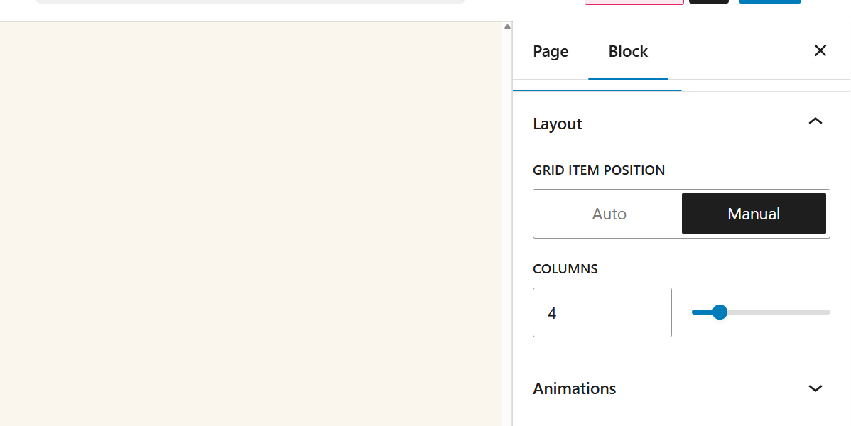
Sometimes, this automated minimum just doesn’t cut it, either breaking too early or too late, breaking content or affecting readability. The manual route is the next obvious choice, however this will only give you a class of “is-layout-9” within the frontend and will not automatically break for smaller screens.
Not an ideal solution if you want to ensure all grids of 4 break in the same way. If you had 10 grid blocks, all using 4 columns, you’d need to add repeating CSS for each one.
This is where this our handy function comes in 👇
function add_grid_columns_class( $block_content, $block ) {
    if ( $block['blockName'] !== 'core/group' || empty( $block['attrs']['layout']['type'] ) || $block['attrs']['layout']['type'] !== 'grid' ) {
        return $block_content;
    }

    $layout = $block['attrs']['layout'];
    $column_class = '';

    if ( ! empty( $layout['columnCount'] ) ) {
        // Manual mode
        $column_class = 'columns-' . intval( $layout['columnCount'] );
    } elseif ( ! empty( $layout['minimumColumnWidth'] ) ) {
        // Auto mode: Estimate columns
        $min_width = intval( $layout['minimumColumnWidth'] );
        $container_width = 1200; // Adjust to your theme's max width
        $estimated_columns = max( 1, floor( $container_width / $min_width ) );
        $column_class = 'grid-' . $estimated_columns;
    }

    if ( $column_class ) {
        // Add class to the block wrapper
        $block_content = preg_replace(
            '/<div class="([^"]*)"/',
            '<div class="$1 ' . esc_attr( $column_class ) . '"',
            $block_content,
            1
        );
    }

    return $block_content;
}
add_filter( 'render_block', 'add_grid_columns_class', 10, 2 );
We often prefer to modify the HTML output without JavaScript, in this case, we can use the render_block filter to add the column class when the Grid block is rendered. The result is an additional class we can tie into for responsive controls:
<div class="wp-block-group is-layout-grid wp-container-core-group-is-layout-9 wp-block-group-is-layout-grid columns-4">Was this snippet useful? Or see where it could be improved? Give me a shout on LinkedIn