Microsoft’s Clarity is a free analytics tool which provides website usage statistics, session recording, and heatmaps. Compared to Google Analytics, it’s fairly basic whilst being robust, easy to use, and it has some potentially useful features.
What is Microsoft Clarity?
Whilst other analytic tools focus on things like reporting on traffic, keywords, referrals, etc. Microsoft Clarity focuses more on user experience to help website owners gain insight into how users are interacting with their site. This data can assist with identifying areas of the website that may need improvement, visual bugs and monitor conversion rates.
The main features of Microsoft Clarity:
Clarity Insights
Clarity’s dashboard lacks some of the usual metrics you’d expect from an analytical tool like this, however it makes up for this with it’s ease of use and filtering system. Useful metrics such as scroll depth, load times and engagement are clear and easy to understand.
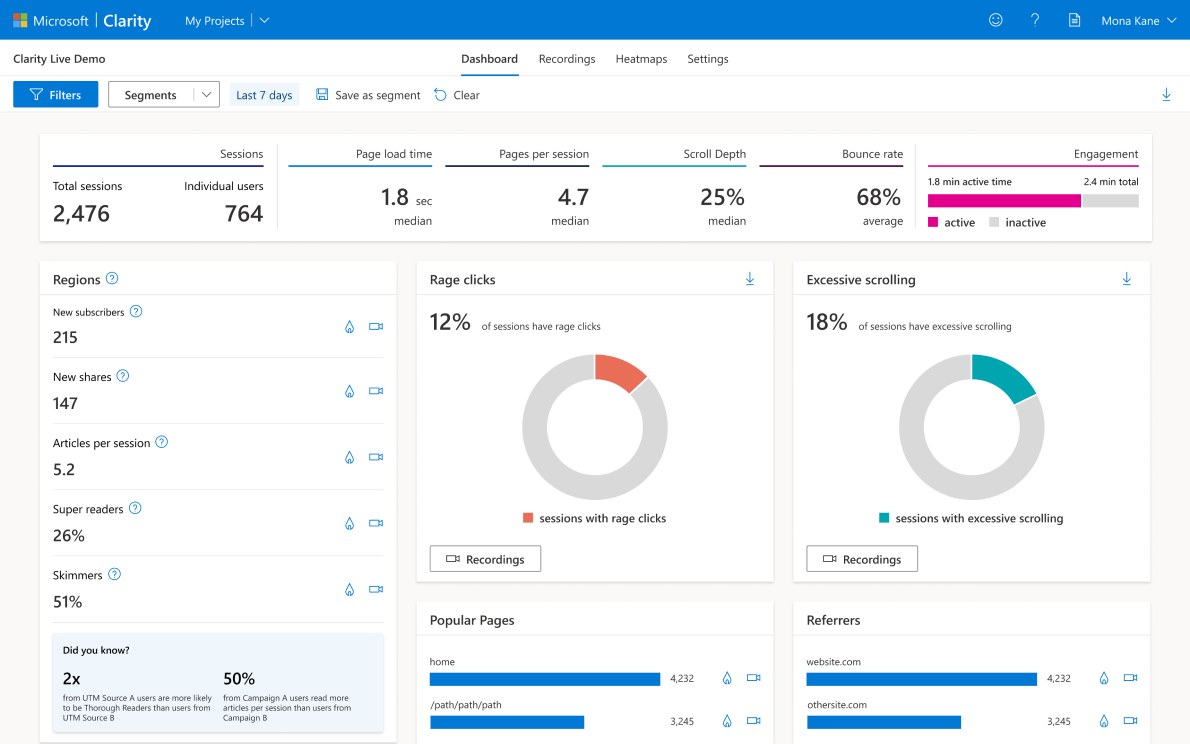
Beyond the usual metrics, Clarity provides further metrics such as ‘rage clicks’ and ‘dead clicks’, data that may show who might have been confused or annoyed by the user interface. Watching the recordings of these triggers may reveal where your website is letting your users down. Fixing these highlighted issues could be a great way to improve engagement, reduce bounce rates, or increase conversions.
Session Recordings
One of the highlights to Clarity is that user sessions are recorded. Clarity logs mouse movement, scrolling and clicks of visitors who visit your website. These can then be replayed to reveal how the user has interacted with website elements.
Each of the dashboard panels provides shortcuts into these kinds of video recordings. You can drill down to see recordings from popular pages, from frustrated users, or from specific browsers.
Clarity Heatmaps
We all love a good heatmap, many analytical tools will tell you how the user found your webpage or even where they left, but not necessarily what they do when they finally land.
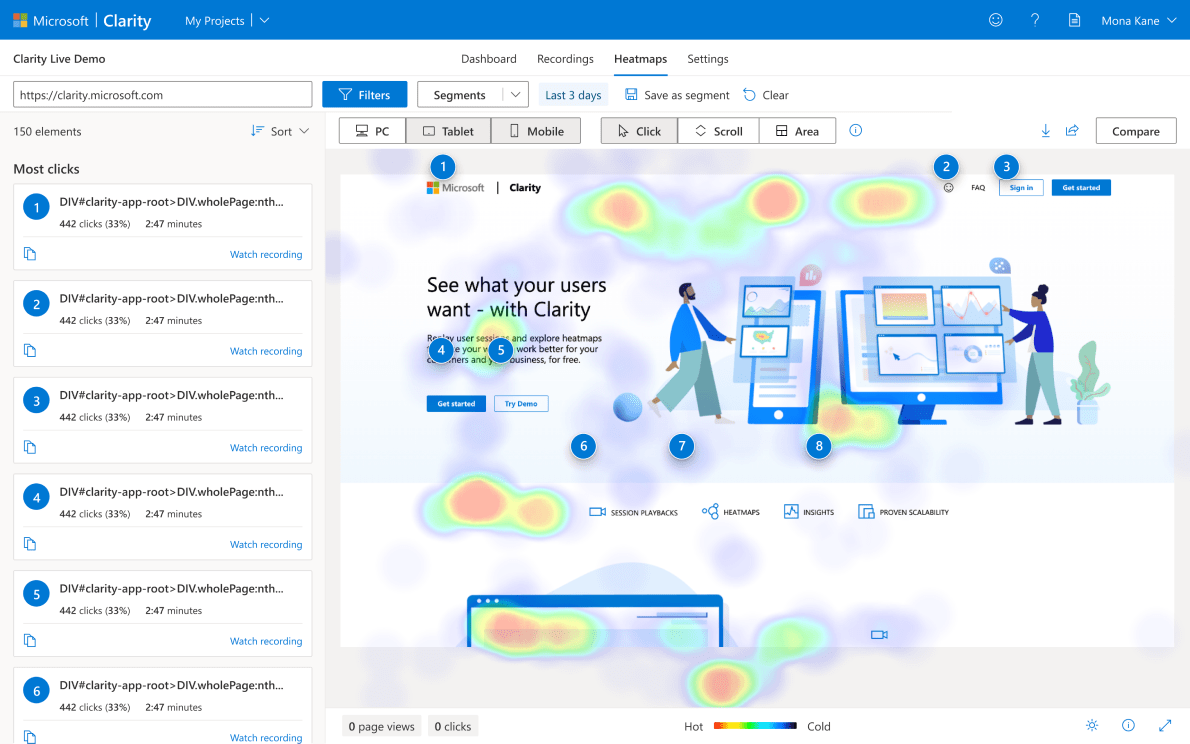
Clarity’s heatmap tool records where users click and scroll. A useful feature to identify popular regions of the page and a way to highlight where some CTA’s may not be performing as well as you think.
Aside from clicks and scrolls, there’s not much else to see here, however with more data, these heatmaps do become well-illustrated with activity to easily identify where elements could be improved.
What Microsoft Clarity isn’t…
Whilst Clarity boasts a range interesting and useful features, it’s certainly not a complete replacement for other analytical tools in a like-for-like manner. That’s not a bad thing of course, from our perspective, this simplicity has been a fantastic asset for ourselves and many clients.
Those of you who are familiar with Google Analytics will know first hand how overwhelming the interface and data can be at times. Having a resource that strips this data back slightly makes it all that more client-friendly.
Privacy & Clarity
One aspect of any analytical tool that should always be considered is privacy. Thankfully Microsoft’s Clarity has considered this and provided the means to omit certain data from reports. The majority of content can be hidden automatically so you’re unlikely to come across someone’s address or payment details.
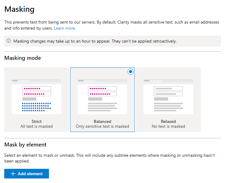
One particular feature Clarity does well is hiding elements by HTML attributes. For example, you may wish to completely mask a user’s profile page to remove any risk of seeing any identifiable data. There’s more detail on how to do that on their help page.
Clarity have provided a useful FAQ, should you have any questions.
In conclusion
Microsoft Clarity has found a gap in the market by actually limiting the amount of data it reports. Instead, it focuses on ease-of-use and displaying metrics simply and effectively.
During our set up, it took us under 5 minutes to get an account set up and then 30 minutes for the first results to be reported.
The only negatives we can think of at the time of this article is around the lack of some important metrics, such as bounce rate (don’t get us wrong, we like the simplicity, but some metrics can’t be ignored by clients), and the lack of customisation around being able to swap/hide/move the dashboard elements to preferred layouts.