Looking to give your online shop a fresh, modern look? We’ve rounded up some of the best eCommerce website designs for 2025 to give you plenty of inspiration. From clever layouts to brilliant user-friendly features, these examples show how to stand out and keep your customers coming back for more. Let’s dive in and explore what’s possible!
EasyPlant
EasyPlant’s intuitive layout, clear value proposition, and targeted collections engage users by highlighting the benefits of self-watering plants. With optimized UX/UI, smooth navigation, and lifestyle imagery, this site excels in converting visitors to buyers.
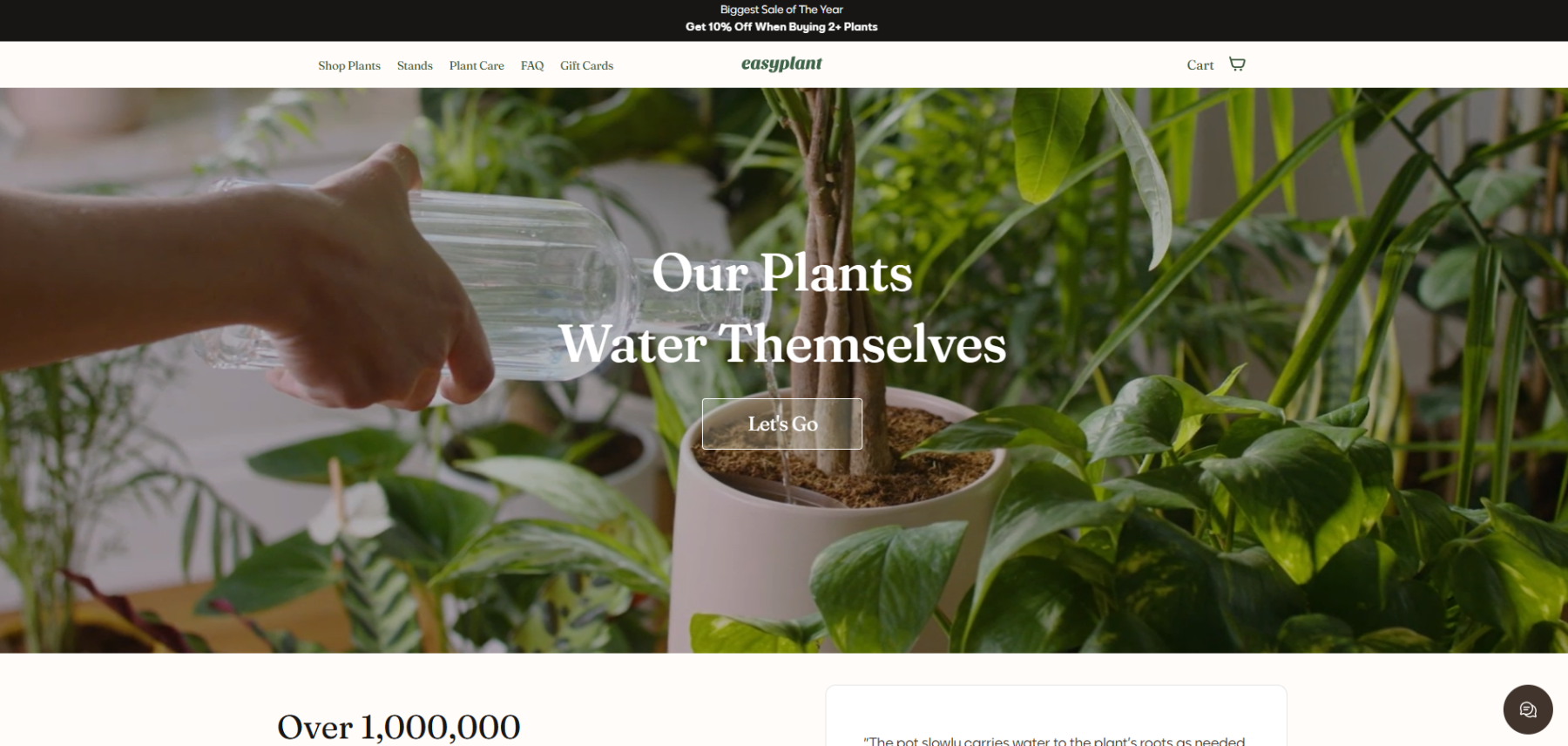
EasyPlant’s site excels as an e-commerce platform for several reasons:
- User-Centric Design: It has an intuitive, visually appealing layout with high-quality images that engage visitors and emphasize the product.
- Clear Value Proposition: Each product emphasizes the benefits of self-watering technology, which is prominent across the site, reinforcing its unique selling point.
- Optimized UX/UI: The easy navigation, quick load times, and responsive design ensure a seamless experience across devices, enhancing customer satisfaction.
- Conversion-Oriented Features: The site includes a streamlined checkout process, trust indicators, and clear calls-to-action, all of which can effectively drive sales.
- SEO and Content Strategy: Targeted collections (like pet-friendly or low-light plants) align with specific search queries, likely improving organic visibility while addressing diverse customer needs.
- Visual Storytelling: The plant care information and lifestyle imagery not only educate users but create an aspirational appeal, fostering engagement and helping buyers visualize the product’s fit in their homes.
These elements collectively enhance the user experience, strengthen brand loyalty, and support conversions, making EasyPlant a strong example of e-commerce design and strategy.
Crate & Barrel
https://www.crateandbarrel.com/
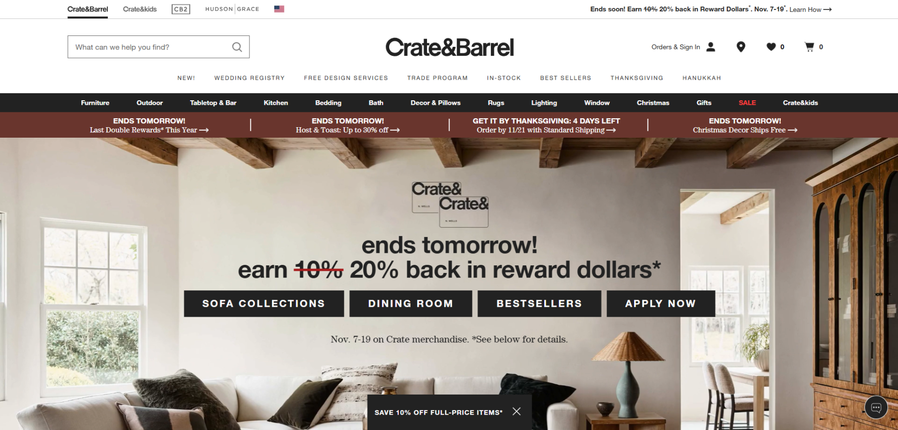
Crate & Barrel’s website offers a stellar user experience through:
- Engaging Multimedia: Videos and lifestyle images are used throughout, showcasing products in realistic settings, adding depth to the shopping experience.
- Intuitive Navigation and Filtering: Users easily find products with well-organized menus and extensive filters, which enhance browsing and speed up decision-making.
- Personalization Tools: Room planners, design advice, and a wedding registry cater to individual needs, fostering engagement.
- Responsive Design: Optimized across devices, the site ensures consistent performance, supporting smooth mobile and desktop shopping experiences.
Explore it further at Crate & Barrel.
Oé
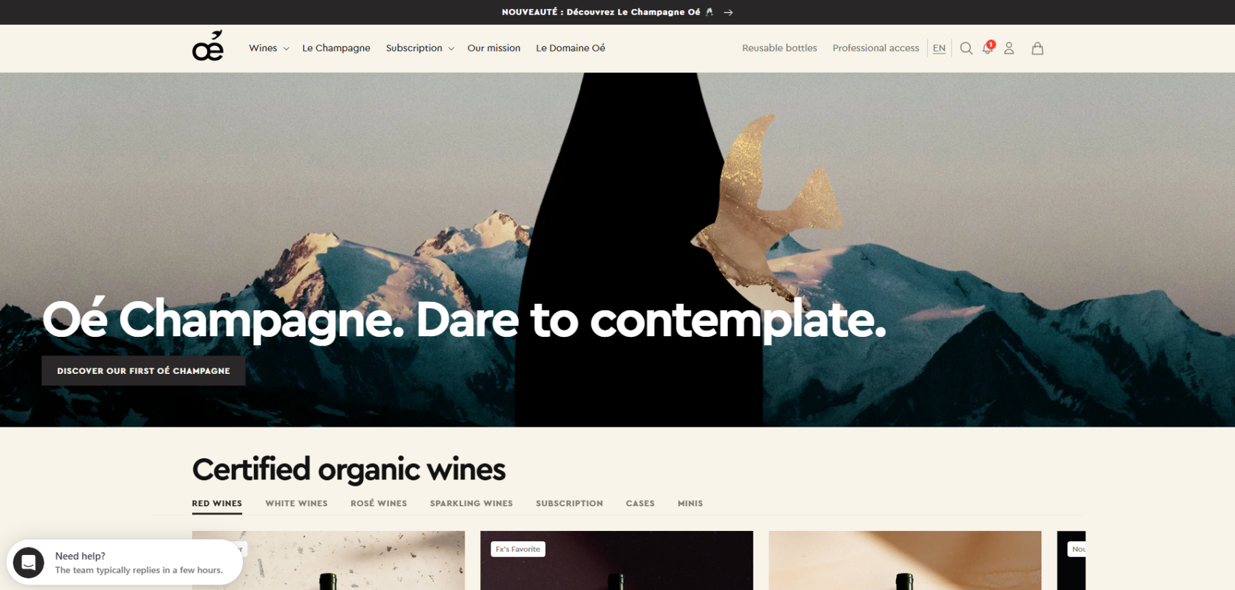
the Oé website demonstrates strong e-commerce design through:
- Visual Storytelling: High-quality images and an impactful message emphasize Oé’s organic, zero-waste wine mission, appealing to eco-conscious buyers.
- Educational Content: Sections explaining organic practices and sustainable initiatives engage users and build trust.
- Clear Navigation and Filter Options: Organized product categories and filtering help users explore wines based on preference, making the shopping experience more seamless.
- Responsive and Accessible: Optimized for all devices, ensuring consistent performance.
Explore more at Oé.
Perfect Keto
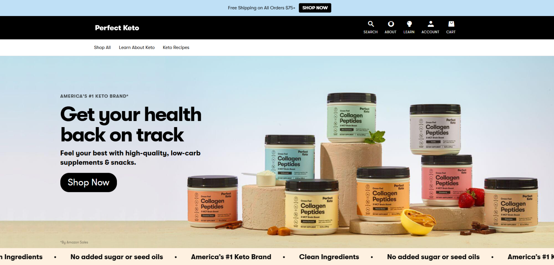
Perfect Keto leverages strong e-commerce design through:
- Content-Rich Experience: Educational resources like blogs, recipes, and a keto calculator engage and build trust, guiding users in keto-friendly choices.
- Effective Use of Carousel Sliders: Sliders showcase additional products without taking up screen space, keeping the interface clean and organized, especially useful on mobile.
- Clear Navigation and Visual Appeal: High-quality imagery, organized categories, and intuitive navigation enhance usability.
- Responsive Design: Optimized for all devices, the site maintains a smooth shopping experience.
Explore more at Perfect Keto.
Casely
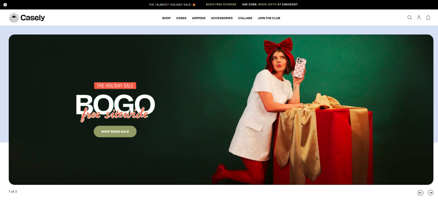
Casely offers an engaging e-commerce experience through:
- Dynamic Instagram Feed: A live feed connects users with real-world product photos, building community and trust.
- Vibrant, Colorful Design: The site’s bold colors reflect Casely’s playful brand and appeal to a younger demographic, aligning well with the product style.
- Organized Navigation and Product Sliders: Compact carousels make browsing easy without overwhelming the page.
- Mobile Optimization: Consistent performance across devices enhances usability.
Explore more at Casely.
Pura Vida Bracelets
https://www.puravidabracelets.com
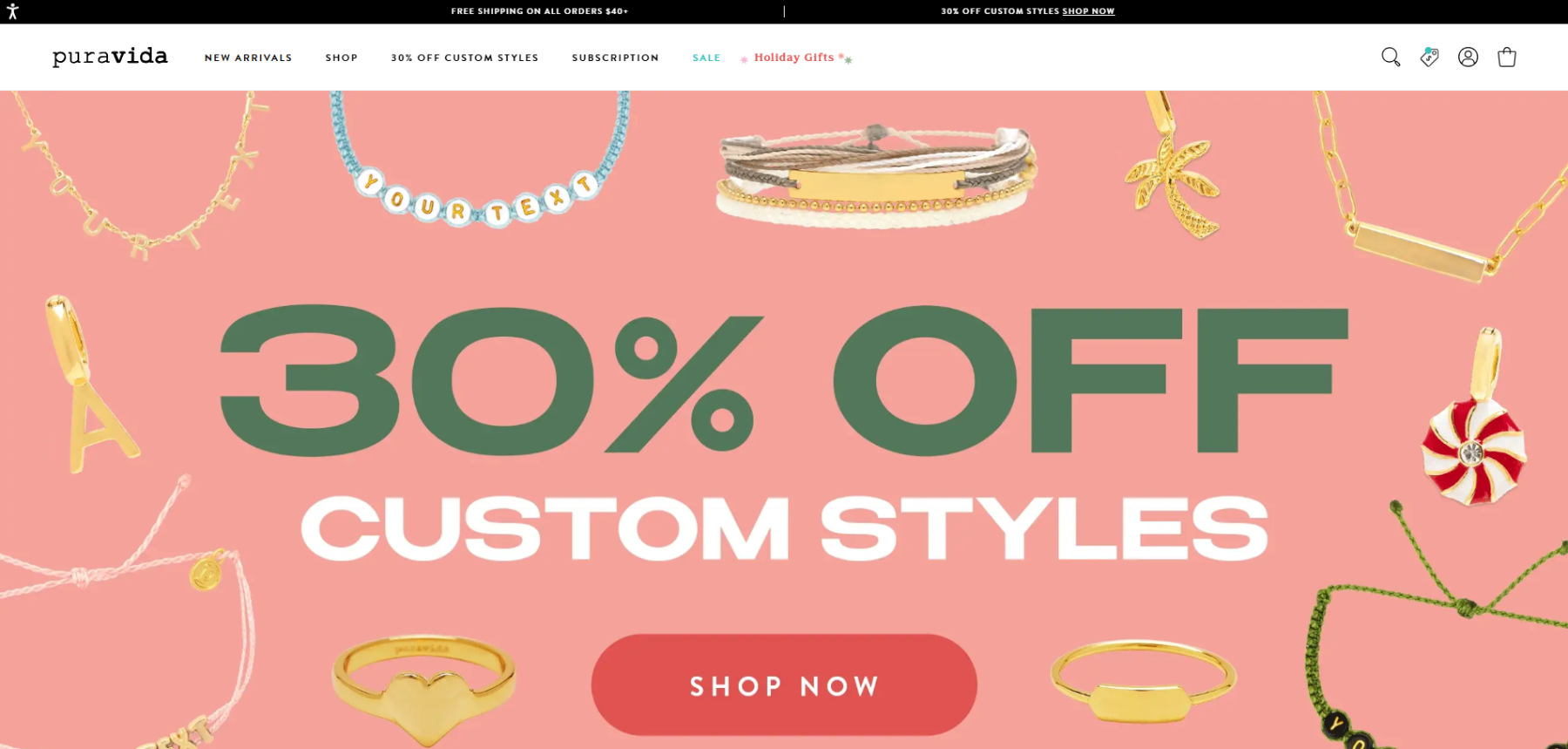
Pura Vida Bracelets delivers a rich user experience through:
- Comprehensive Filtering Options: Users can easily shop by category, featured styles, trending items, or collections right from the homepage.
- Dynamic Instagram Integration: A live social feed builds community by showing real-world product photos.
- Colorful, Relaxed Aesthetic: The vibrant design aligns with the brand’s beach-inspired identity.
- Interactive Carousels and Responsive Design: Carousels save space and enhance usability across devices.
Explore further at Pura Vida Bracelets.
Ledger
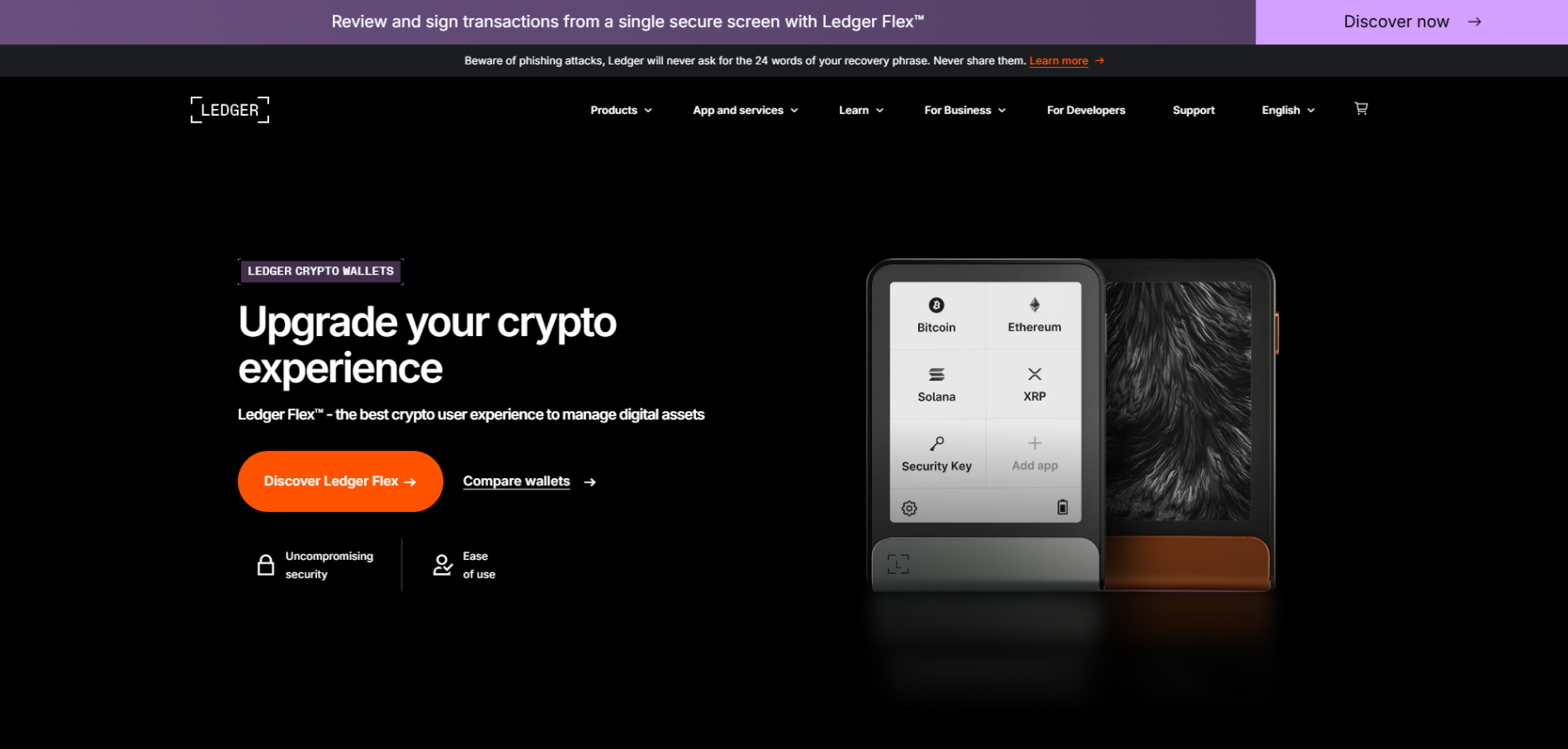
Ledger‘s site impresses with a unique design approach:
- Modern Dark Color Scheme: The sleek, dark aesthetic gives a cool, technical feel, perfectly aligned with its focus on crypto security.
- Educational Resources: In-depth resources like Ledger Academy support informed purchases and build brand trust.
- Intuitive Navigation and Product Filters: Users can easily compare hardware wallets, accessories, and navigate through crypto solutions.
- Responsive and Visual Design: High-quality visuals and an optimized layout enhance usability across devices.
Explore more at Ledger.
The Bouqs Co
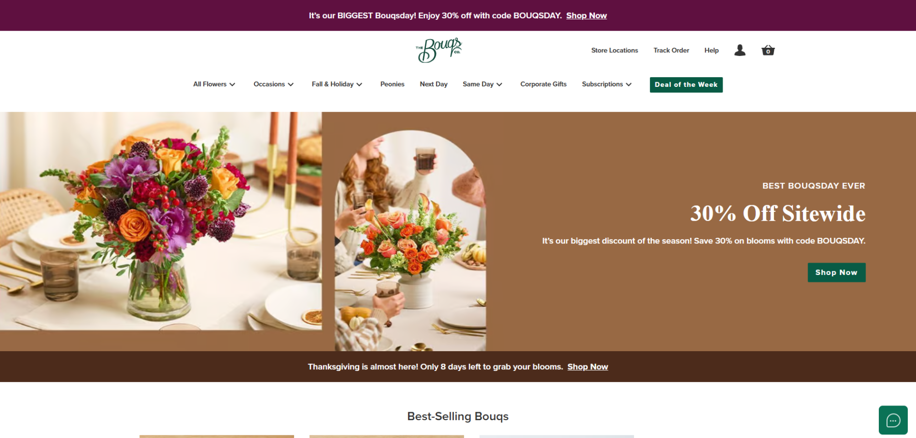
The Bouqs Co. site provides a fresh, user-friendly experience through:
- Vibrant Floral Imagery and Clean Layout: High-quality photos highlight the farm-fresh arrangements, creating an appealing visual impact.
- Detailed Filtering Options: Users can browse by occasion, collection, or subscription services directly from the homepage.
- Sustainability Emphasis: Messaging around eco-friendly, farm-direct flowers resonates with environmentally conscious customers.
- Mobile-Optimized Design: A responsive layout with carousels ensures easy navigation across devices.
For more, visit The Bouqs Co..


