

Making your charity’s website accessible isn’t just a legal requirement, it’s about ensuring that everyone, regardless of ability, can engage with your cause. Whether someone wants to donate, sign up as a volunteer, or simply learn more about your work, your website should be easy to navigate for all.
Out of 100 nonprofit organisations, 98% had detectable accessibility issues, with an average of 49 errors per page
A 2019 study by WebAIM analysed the homepages of the top 100 nonprofit organisations and found that 98% had detectable accessibility issues, with an average of 49 errors per page. Common issues included low contrast text, missing alternative text for images, and empty links. This means many charities could be missing out on vital support, simply because their websites aren’t user-friendly for everyone.
The good news? Making your site more accessible doesn’t have to be complicated. Small changes can make a big difference!
Why accessibility matters
Understanding the law: The Equality Act 2010
In the UK, the Equality Act 2010 legally requires organisations, including charities, to make “reasonable adjustments” so that disabled people can access their services, this includes websites. If a website is inaccessible, it could be considered discriminatory, which not only puts a charity at risk of legal action but also alienates potential supporters.
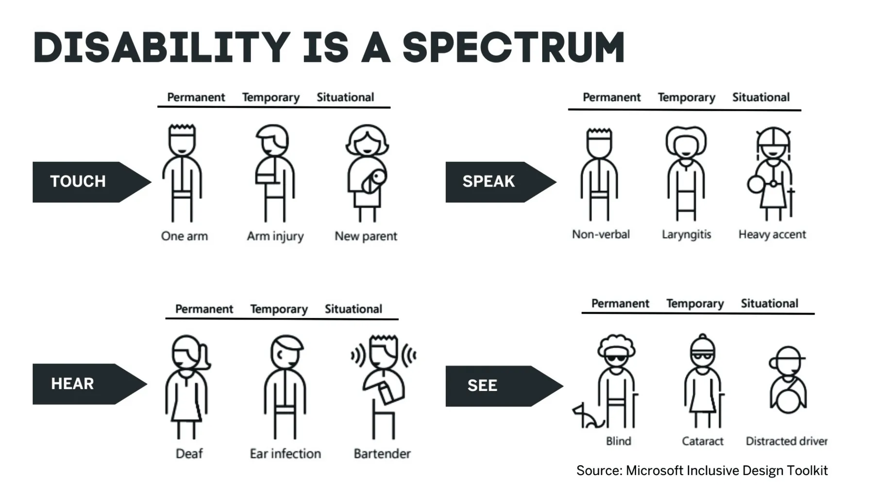
Beyond the legal side, making your website accessible is the right thing to do. Around 24% of the UK population has a disability, meaning a huge number of people could struggle to use an inaccessible website.
Charities exist to help people, so ensuring your digital presence is welcoming to all is essential.
24%
of the UK population has a disability
Simple steps to make your website more accessible
Improving accessibility doesn’t have to be expensive or time consuming. Here are some easy ways to make your charity’s website more inclusive:
1. Make sure your website works with a keyboard
Not everyone can use a mouse, many people with mobility impairments or visual impairments rely on a keyboard to navigate websites. That means your site should be fully usable with just the keyboard, allowing users to move through pages using the Tab key and activate buttons or links with the Enter key.
Try it yourself: go to your website and see if you can navigate everything using only your keyboard. If you get stuck or can’t access certain sections, your site may need some adjustments, like improving focus outlines or using proper HTML for interactive elements.
2. Add alt text to all images
Alt text (short for alternative text) is a simple but powerful tool that makes images accessible to people using screen readers. It’s a short description of what an image shows, helping visually impaired users understand the content.
For example:
✅ Good alt text: “A volunteer helping a child read a book.”
❌ Bad alt text: “Image1234.jpg”
If an image is purely decorative and doesn’t add meaningful content, you can leave the alt text blank (alt="") so screen readers ignore it.
3. Use high-contrast colours for readability
Text should always be easy to read, and one of the biggest mistakes websites make is using low-contrast colours (like light grey on white). This makes reading difficult for people with visual impairments, colour blindness, or even those viewing your site on a bright screen.
A simple way to check if your text has enough contrast is by using the WebAIM Contrast Checker. Aim for a contrast ratio of at least 4.5:1 for body text and 3:1 for larger text. If your contrast is too low, adjusting the colours in your website’s settings or CSS can fix the issue.
4. Write descriptive link text
Screen readers often scan through a page’s links to help users navigate quickly. If your website has vague links like “Click here” or “Read more“, this can be confusing, especially if there are multiple links like this on a page.
Instead, use descriptive links that clearly explain what the user is clicking on. For example:
This small change makes it much easier for users to find what they need.
Further reading:
- Enhancing CTA readability
- Why Your Website Isn’t Converting and How to Fix It in 2025
- How to Build a Website for Local Businesses That Converts Visitors
5. Make content simple and clear
Avoid unnecessarily complex language whilst breaking up dense text into smaller, manageable chunks makes content more accessible to a wider audience. It reduces cognitive load and visual clutter, while improving focus.
❌ Overly Complex
The rapid, melanistic vulpine specimen expeditiously maneuvered over the lethargic, umbrageous canine entity, executing a deft and acrobatic traversal with remarkable alacrity.
✅ Simplified
The quick brown fox jumped over the lazy dog.
6. Make forms easy to use
Forms are essential for signing up volunteers, collecting donations, or gathering contact details, but they need to be accessible. Every form field should have a clear label explaining what information is needed.
Instead of this:
<input type="text" placeholder="Your name">
Use this properly labelled version:
<label for="name">Full Name</label>
<input type="text" id="name" name="name">
Also, if a user makes a mistake (like missing a required field), the error message should be clear and helpful, rather than just saying “Error” or highlighting a field in red, which won’t help users with colour blindness.
Note: Sometimes this label may not be 100% necessary if the purpose is ‘that’ obvious. For example, a search input field next to a “Search” button where “Search” is visible text in the button.
7. Utilise online solutions like audio transcription and accessibility widgets
Tools like Beyond Words, UserWay, and AccessiBe help enhance website accessibility and user experience by leveraging AI-driven solutions. Beyond Words provides AI-generated audio narration, making content more accessible to users who prefer or require audio over text, such as those with visual impairments or dyslexia. It also improves engagement and SEO by allowing users to consume content in multiple formats.
UserWay and AccessiBe focus on web accessibility, using AI to ensure compliance with WCAG (Web Content Accessibility Guidelines) and ADA (Americans with Disabilities Act) standards. They provide features like automated alt text generation, keyboard navigation enhancements, and screen reader compatibility, making websites more inclusive for people with disabilities. These tools not only improve user experience but also help businesses avoid legal risks and expand their audience reach.
Why it’s worth the effort
Improving your website’s accessibility isn’t just about avoiding legal trouble, it has real benefits for your charity:
✅ You’ll reach more people – One in five people in the UK has a disability. Making your website accessible ensures that they can support your cause, whether through donations, volunteering, or sharing your message.
✅ You’ll boost your reputation – Showing that your charity is inclusive builds trust with supporters, funders, and the communities you serve.
✅ Your site will rank better on Google – Many accessibility improvements (like using alt text and structured headings) also improve SEO, helping more people find your website.
Final thoughts
Making your charity’s website accessible is one of the best things you can do in 2025. It’s not just about compliance, it’s about ensuring that everyone, regardless of ability, can engage with and support your work.
The good news? Many of these changes are quick and simple to implement, yet they make a huge difference to your users. By taking these steps, you’re helping to create a more inclusive online space where everyone can participate.
Want to check if your website is accessible? Book a call with our team to discuss your website together. Additionally, tools like WAVE and Recite Me can scan your site and highlight areas that need improvement.
Let’s improve the internet for everyone, starting with your charity’s website 💪