Rebuilding Sight Research UK On WordPress
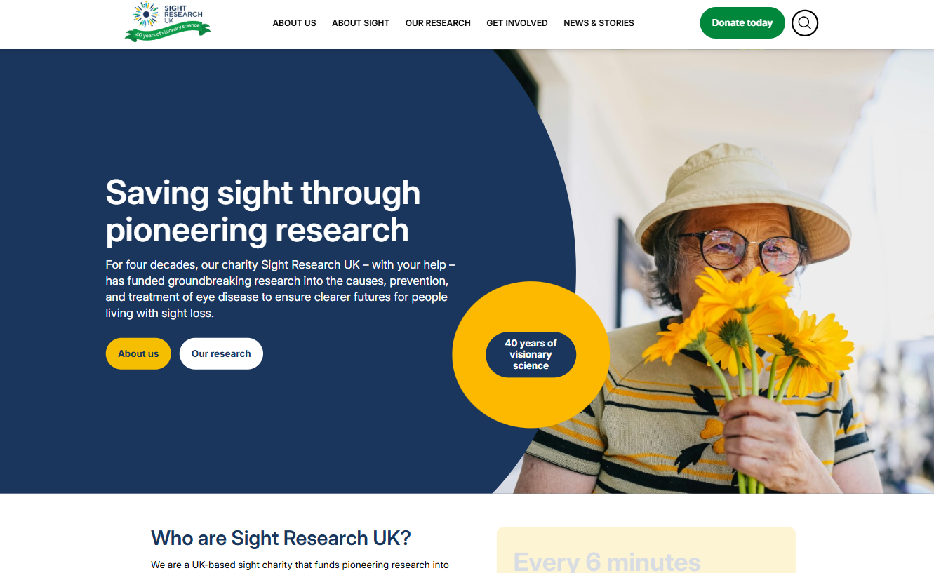
Sight Research UK funds breakthrough vision research. Their site was holding them back – slow, hard to edit, and quietly leaking donations. We rebuilt it on a custom WordPress block theme, redesigned the donate flow, and migrated 12 years of content URL-for-URL.
70.0%
Engagement Rate
+87.3%
Search Clicks
98/100
Core Web Vitals
0.6s
TTFB at p95
From no control to full control: a Django to WordPress migration
With ambitious growth targets and a clear long-term vision, they recognised that their existing website needed to evolve to match the scale of their mission.
Their goals were bold and measurable:
- Increase monthly users from 5,500 to 18,000 by 2027
- Improve search engine visibility to reach the top 10 for key terms
- Ensure full accessibility compliance while enhancing overall user experience
The existing Django platform limited flexibility, content control and speed of iteration. To achieve meaningful digital growth, SRUK needed more than a visual refresh — they needed a robust, future-ready platform that empowered their internal team and supported their long-term strategy.
Four key moves.
An ongoing plan.
A custom block theme, owned by the charity.
We replaced a tangle of plugins with a focused block theme. The client can edit pages without breaking layouts.
- Native WordPress block editor
- Reusable patterns, locked down for editors
- Zero page-builder dependencies
Schema Data + Content Plan
What good is a new website without a content plan. We've helped formulate a path for the next 12 months to help achieve their goals
- SEO & AI-Ready content
- Human-first approach
- Consistancy checks throughout for one, on-brand style.
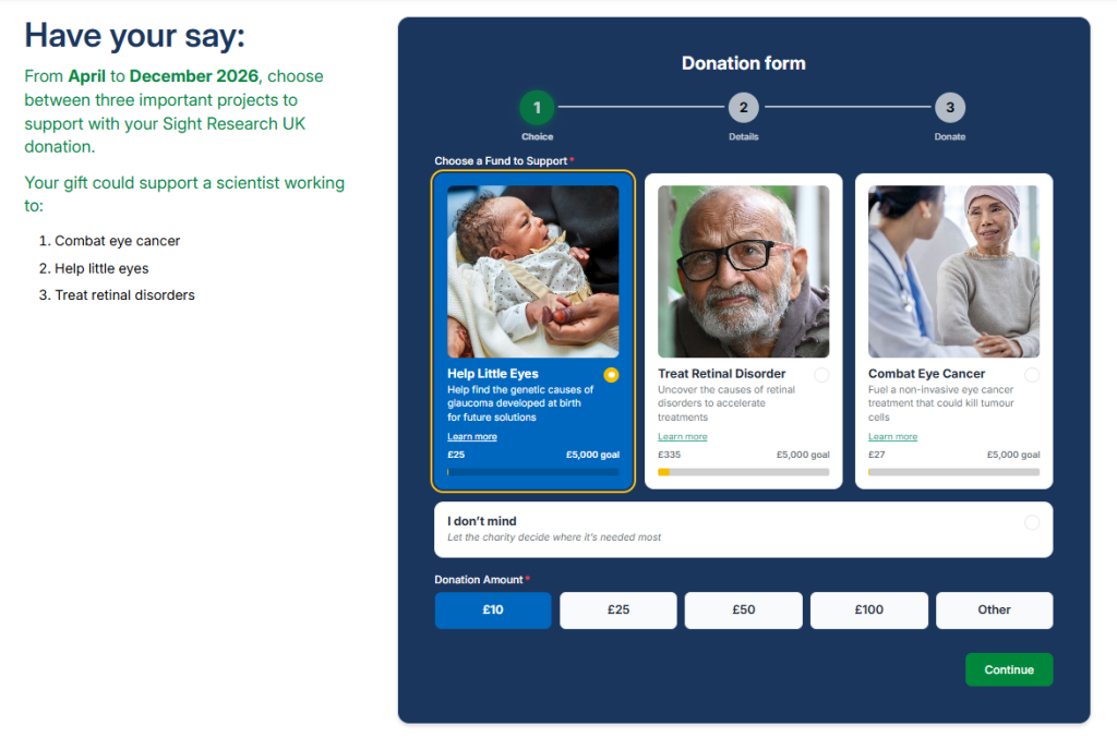
One donate flow. One-off, regular, Gift Aid.
One single and consistant donation flow via forGood
- Stripe Payment Element + GoCardless DD
- Gift Aid claim built into the receipt
- Apple Pay, Google Pay, recurring options
Tracking performance with Astrolytics
By utilising Astrolytics, the client can monitor the effectiveness of campaigns through their own dashboard
- Dashboard to track performance
- History and compare mode
- Current site and Content health checks
A platform built for flexibility
No vanity metrics, no impression counts – just the things the trustees actually report to the board.
+50.3%
Year-on-year, post-launch. Driven by structured data and a content cleanup, not link-buying.
▲ 12 mo
98/100
Up from a “poor” 30 across the board. LCP under 1.2s on 4G, CLS < 0.05.
▲ from 30
£187k
Net new income directly attributable to the rebuilt donate flow and SEO uplift.
▲ vs baseline
Nebula did the thing every agency promises and almost none of them deliver — they made the new site simpler than the old one. Our trustees are publishing again. And the donations? They speak for themselves.
The finished website at a glance.


Five stages. No mystery.
This project followed our typical workflow for WordPress development projects to ensure the website was delivered on scope, budget and time.
Discover
Workshops with the people who’ll actually use the site – editors, fundraisers, service teams.
Design
Accessibility-first, content-first. Components built in Figma and validated on real data.
Build
Custom block theme in Git. Staging from day one. Two-week sprint rhythm.
Launch
Content migration, QA sweep, redirect map, launch-day engineer on standby.
Support
Monthly retainer or block-hour plans. Real humans – the ones who built it.
The stack we shipped – and what we didn’t ship.
• What we built with
Boring tech, used carefully.
Nothing exotic. Everything battle-tested, well-documented, and friendly to the next agency that ever has to touch it.
No Elementor. No Divi. No JS framework on the front end. No third-party donate widgets.
• Accessibility
WCAG 2.2 AA. Audited, signed-off, in writing.
Independent audit pre-launch by a charity-sector specialist. Every flag closed before we shipped — including the donate flow, which the legacy site never tested.
98 / 100 Lighthouse. 1.1s LCP on 4G, zero render-blocking JS on the donate page, 6 plugins total.
One donate flow, three modes. One-off, monthly, Gift Aid — all on-domain, all in one form, four-tap completion.
What changed, in plain English.
Before · the legacy site
An eight-second homepage and a editor no one could use easily
30 / 100 Lighthouse. The website was made before responsive desigh was even a consideration.
An admin UI that confused everyone. Updating the website content was a nightmare for anyone involved.
After · the rebuild
A site the team are proud to send people to.
98 / 100 Lighthouse. 1.1s LCP on 4G, zero render-blocking JS on the donate page, 6 plugins total.
One donate flow, three modes. One-off, monthly, Gift Aid — all on-domain, all in one form, four-tap completion.
Ready for a website you can actually be proud of?
Tell us about the organisation, the problem, and what “good” looks like. We’ll come back within a day with questions, honest thoughts and rough numbers.