Building a Support Platform for Families Facing the Toughest Journeys
We partnered with Meredith’s Mission to design and develop a modern, accessible WordPress website that supports families, engages donors, and clearly communicates the charity’s impact. The result is a fast, user-friendly platform built to grow alongside the organisation.
Ongoing Support
+300%
Avg Search Clicks
91/100
Core Web Vitals
0.18s
TTFB at p95

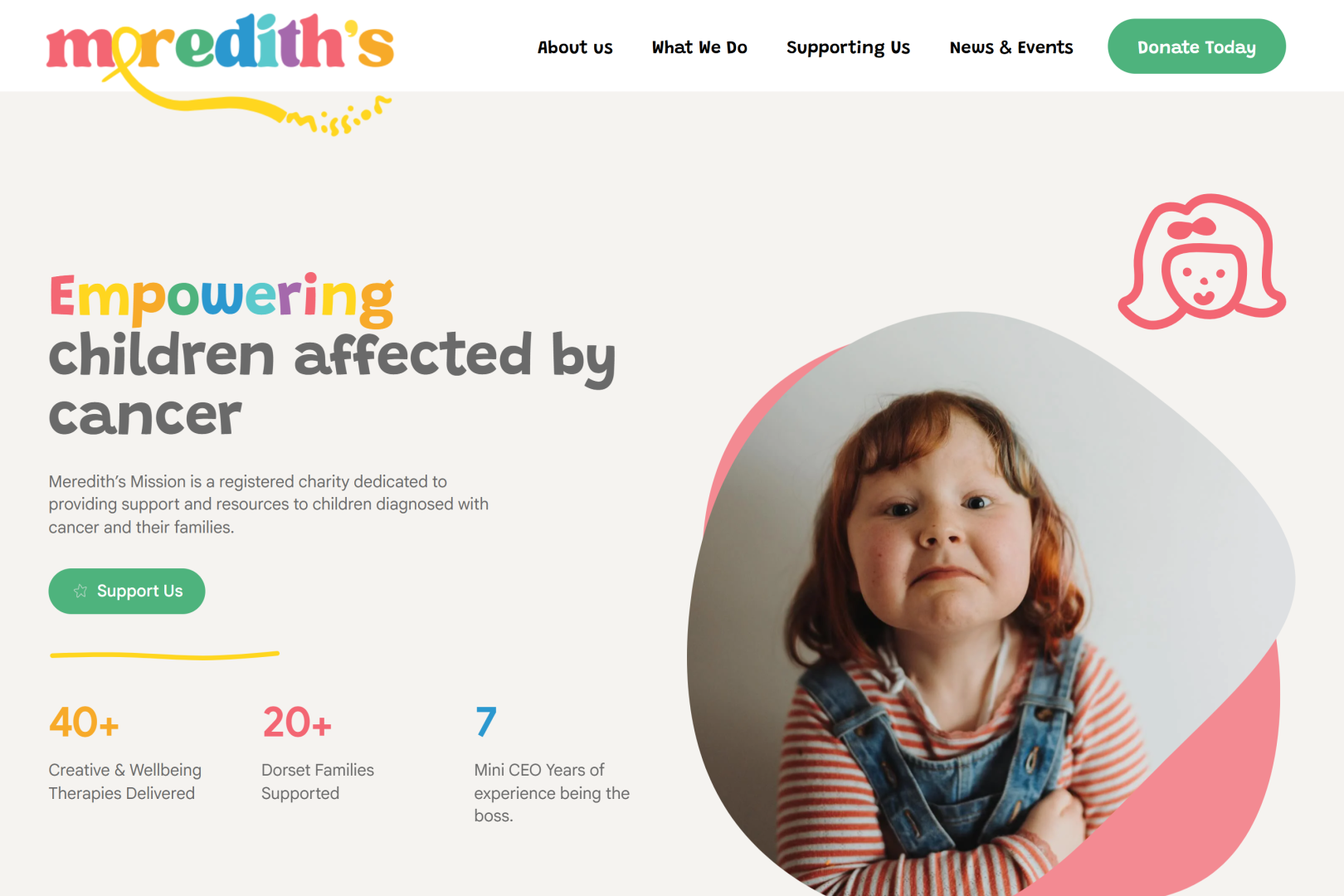
Creating Clarity Around a Complex Mission
The organisation faced a number of challenges common to growing charities:
- Communicating sensitive, emotional subject matter clearly and compassionately
- Supporting multiple audiences — families, supporters and donors
- Improving search visibility around key medical and support-related topics
- Ensuring the website was fully accessible to all users
- Building a platform that could evolve over time
This wasn’t simply about redesigning a website – it was about creating a digital platform that could support real people in real situations.
Four key moves.
An ongoing plan.
A custom block theme, owned by the charity.
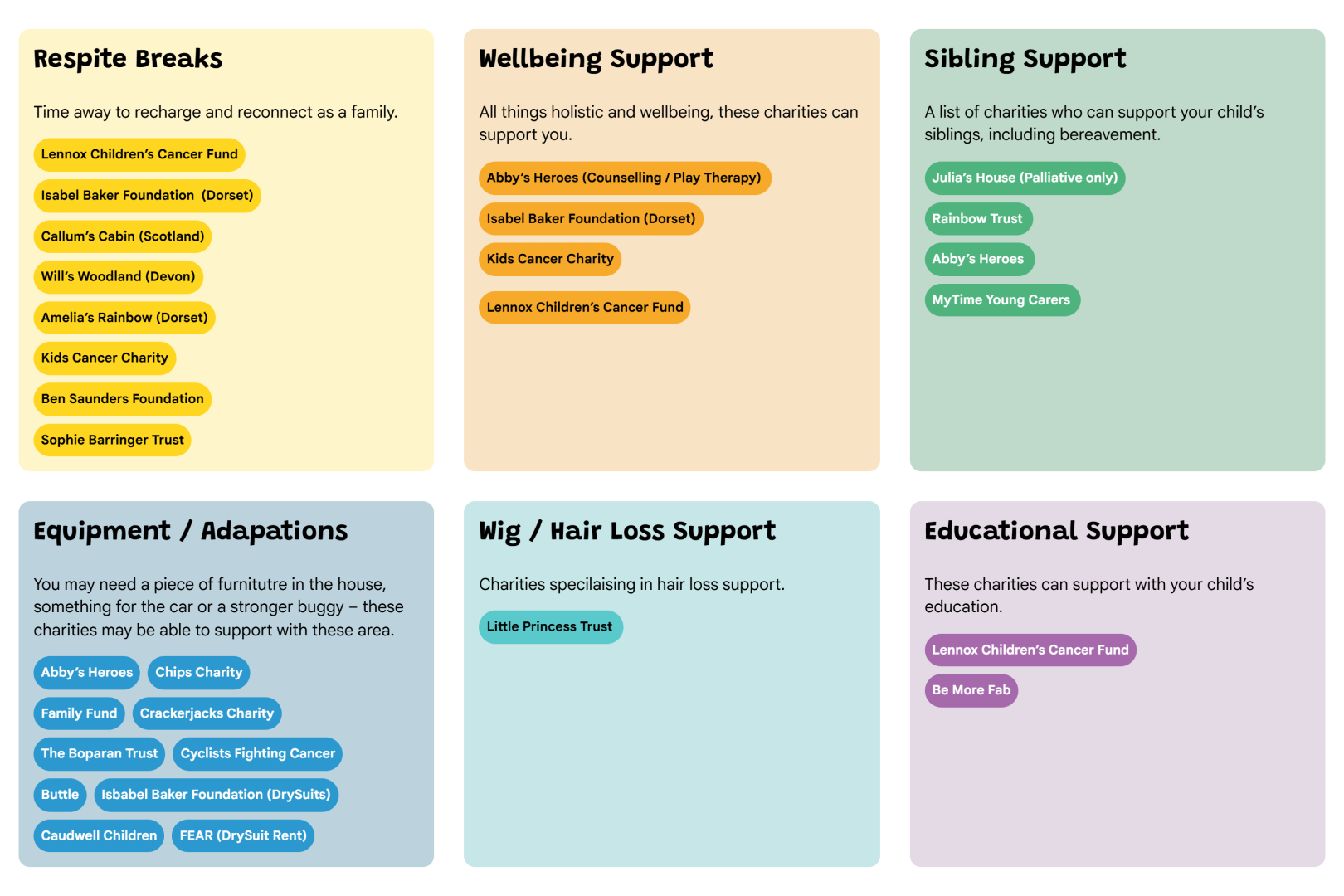
We created a solid foundation for the charity to easily create their own pages whilst remaining on brand
- Native WordPress block editor
- Reusable patterns, locked down for editors
- Zero page-builder dependencies
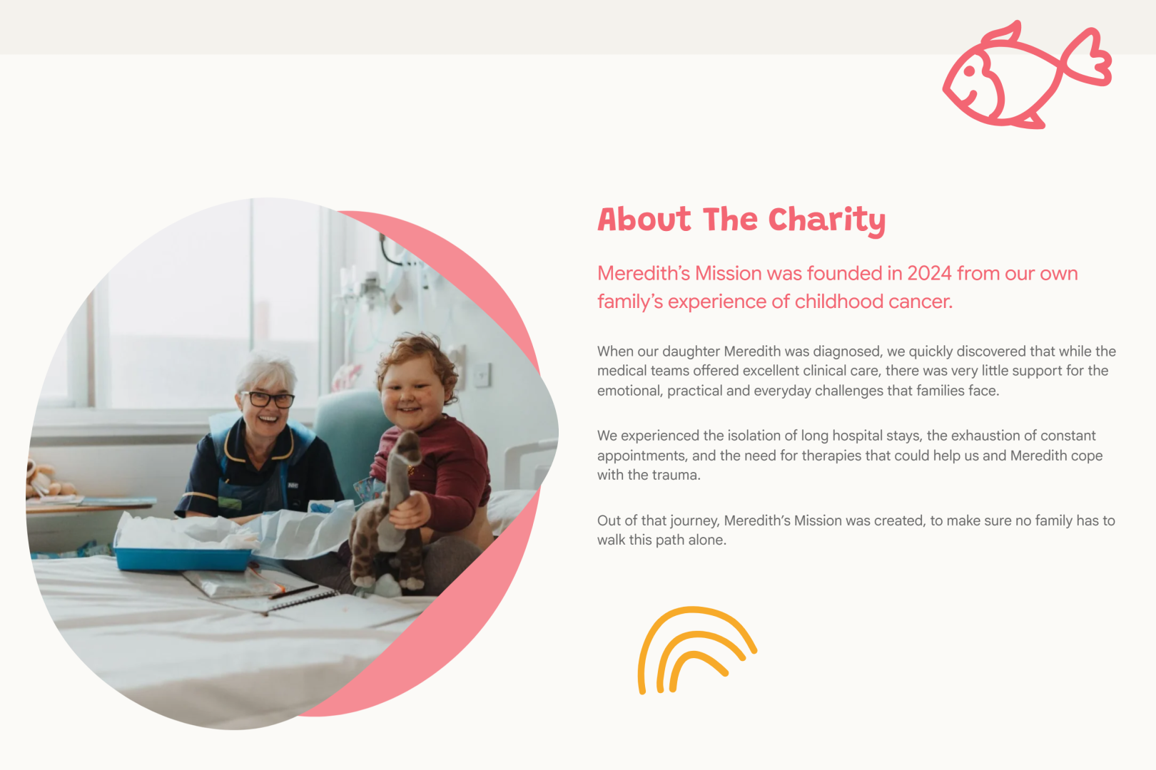
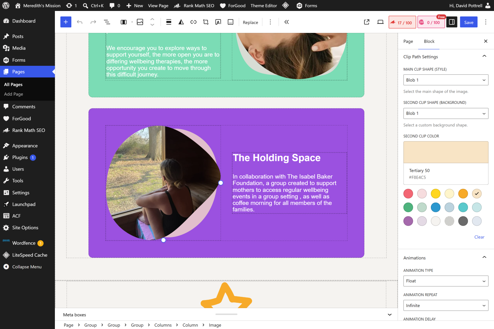
An extention of an existing brand identity
We ensured the various elements that made up each page was reflective of the brand
- Custom illustrations
- Custom Clip Paths
- SVG Borders
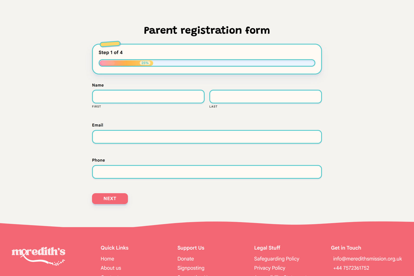
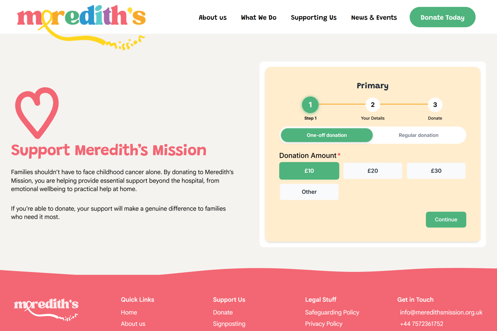
One donate flow. One-off, regular, Gift Aid.
One single and consistant donation flow via forGood
- Stripe Payment Element + GoCardless DD
- Gift Aid claim built into the receipt
- Apple Pay, Google Pay, recurring options
Tracking performance with Astrolytics
By utilising Astrolytics, the client can monitor the effectiveness of campaigns through their own dashboard
- Dashboard to track performance
- History and compare mode
- Current site and Content health checks
Supporting Impact Beyond Launch
No vanity metrics, no impression counts – just the things the trustees actually report to the board.
24/7
Uptime and error monitoring tools enable us to keep an eye on the website and support the site for the future.
92/100
Up from a 28/100 from their existing website, Meredith’s Mission now has a score of 89-92.
▲ from 28
£Pending
Come back in the future to see how it’s improved.
▲▼ vs baseline
The finished website at a glance.
Five stages. No mystery.
This project followed our typical workflow for WordPress development projects to ensure the website was delivered on scope, budget and time.
Discover
Workshops with the people who’ll actually use the site – editors, fundraisers, service teams.
Design
Accessibility-first, content-first. Components built in Figma and validated on real data.
Build
Custom block theme in Git. Staging from day one. Two-week sprint rhythm.
Launch
Content migration, QA sweep, redirect map, launch-day engineer on standby.
Support
Monthly retainer or block-hour plans. Real humans – the ones who built it.
The stack we shipped – and what we didn’t ship.
• What we built with
Boring tech, used carefully.
Nothing exotic. Everything battle-tested, well-documented, and friendly to the next agency that ever has to touch it.
No Elementor. No Divi. No JS framework on the front end. No third-party donate widgets.
• forGood
Seamless online donations with Google & Apple Pay
Using our forGood WordPress add-on Meredith’s Mission can accept donatios online to support the great work they do seamlessly on their website.
Onboarded for free As part of any charity website we develop, we include the onboarding cost of this add-on into the website project.
Reactive & Proactive Improvements. As part of the project, we’re monitoring the performance of the website for improvements to both site performance and user experience.
What changed, in plain English.
Before · the legacy site
A web page with minimal control that didn’t reflect the brand
Easy to edit The website was often difficult to edit and lacked flexibility across its pages.
Disconnected brand Meredith’s Mission’s branding is light and playful, the old website was detached from this.
After · the rebuild
A website the charity can edit themselves that can support them for the foreseeable future
What You See Is What You Get. We’ve ensured that the page the admin can see in the editor reflects the visual on the frontend.
A brand in synergy. Now the website flows from the charities branding, light and playful, whilst providing key information.
Ready for a website you can actually be proud of?
Tell us about the organisation, the problem, and what “good” looks like. We’ll come back within a day with questions, honest thoughts and rough numbers.